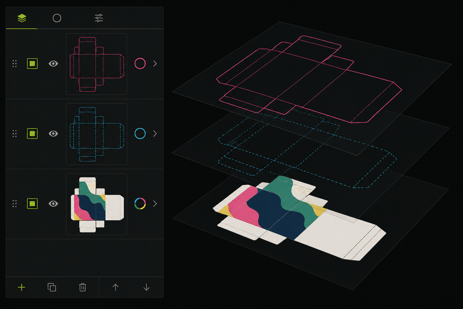
On carton packaging, the print file carries artwork (CMYK) plus a technical cut and crease layer. Without Overprint on the cut line, white stays under the knife; without bleed, edges flash white; if RGB remains, colour shifts on offset.
Lithography and the press often return incomplete files — but sometimes the error only shows at volume. This checklist is for graphic designers and packaging studios reviewing files before FTP or physical handoff.
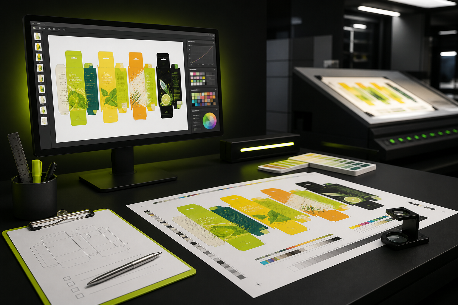
Order of work: accurate dieline first, then artwork on the blank, then this checklist, finally PDF/X or the press-accepted format.
Artwork layer separated from the technical layer.
Main prepress checklist
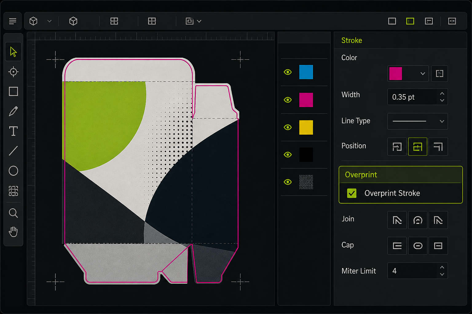
Overprint Stroke on the cut line
The cut layer (usually 0.25pt or 0.5pt) must have Overprint on so plate separation does not leave white under the knife.
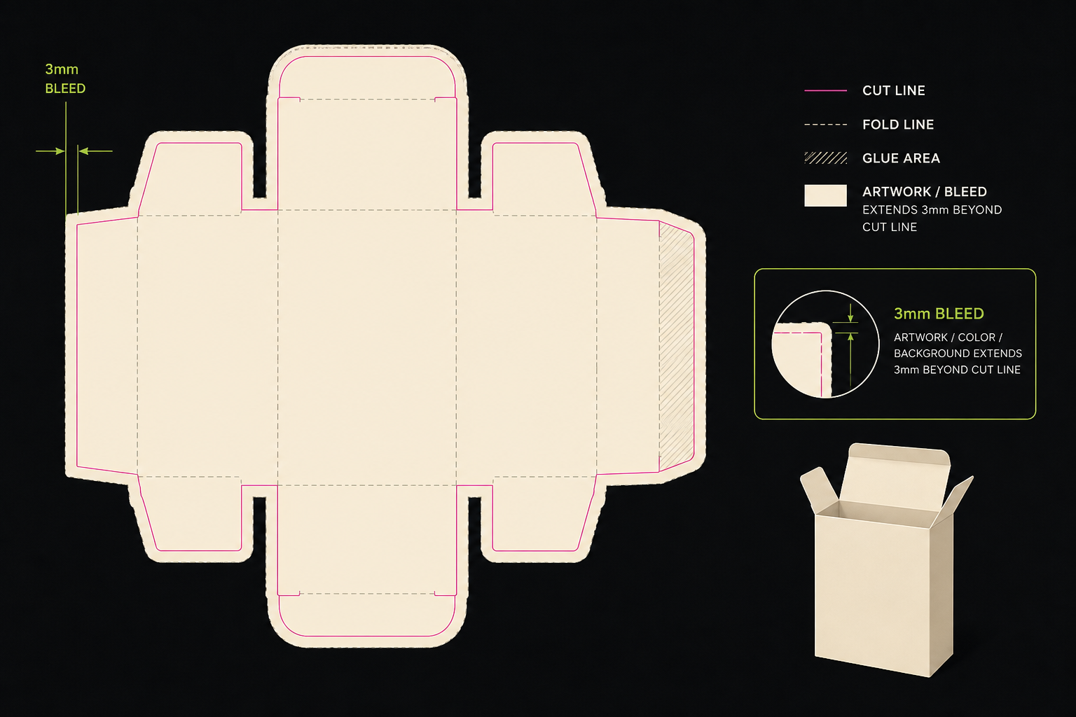
Bleed at least 3 mm
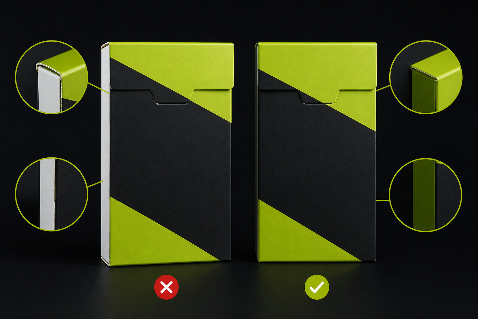
Colour and artwork must extend 3 mm past the cut; otherwise guillotine or die-cut shows a white edge.
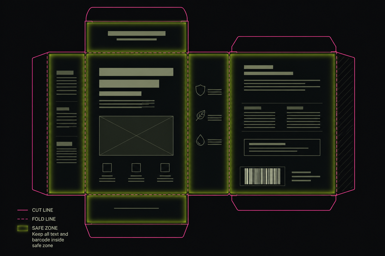
Safe zone for text and logos
Text and barcodes at least 3 mm inside the cut — so press vibration does not trim them.
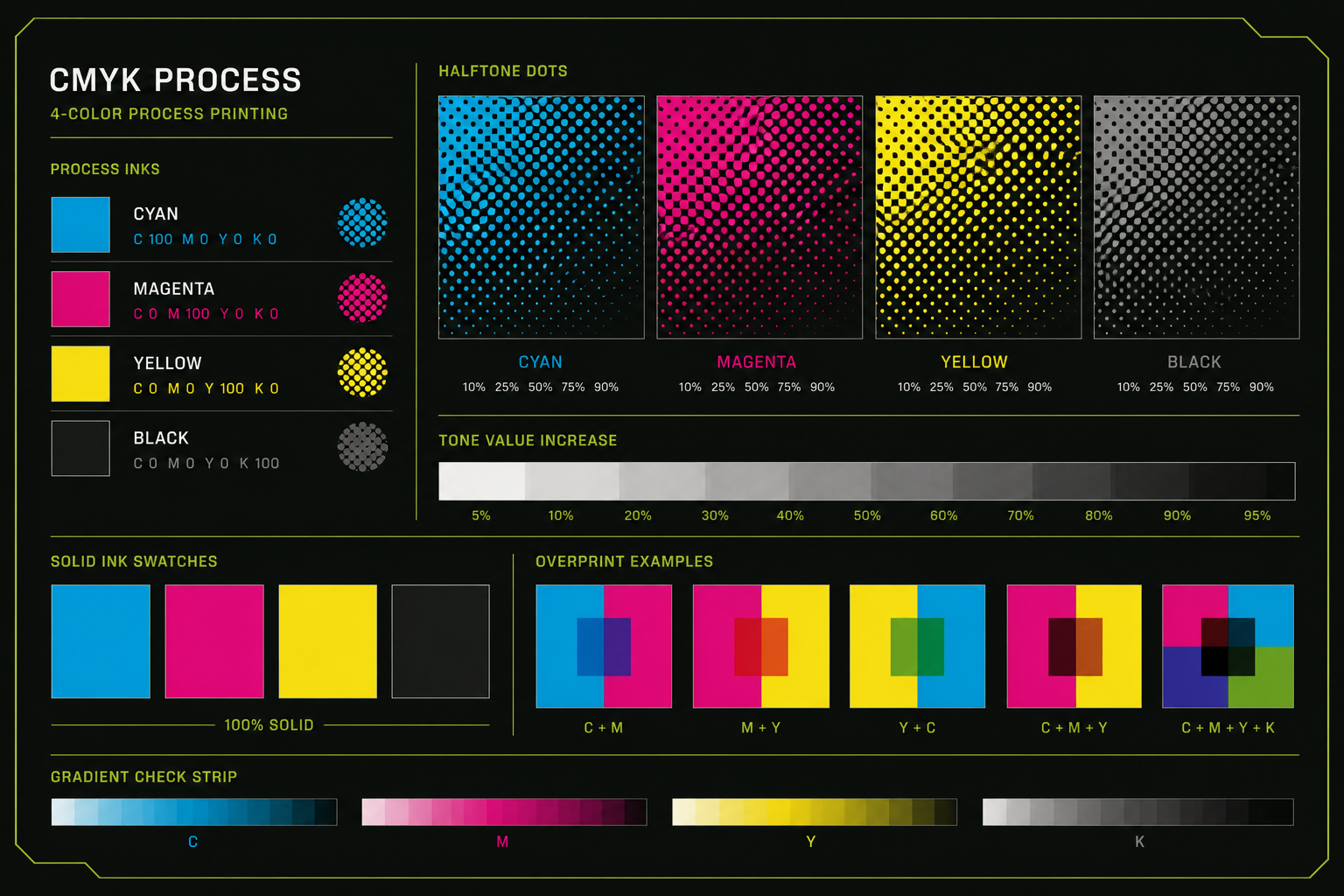
CMYK and no unwanted RGB/Spot
Convert all raster and vector elements to CMYK; Spot colours only for cut/crease/perf with standard names.
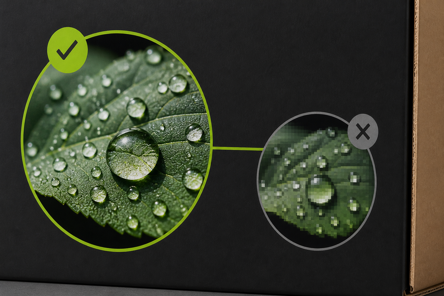
300 DPI for images
Embedded images at least 300 DPI at final blank size; fonts outlined or fully embedded.
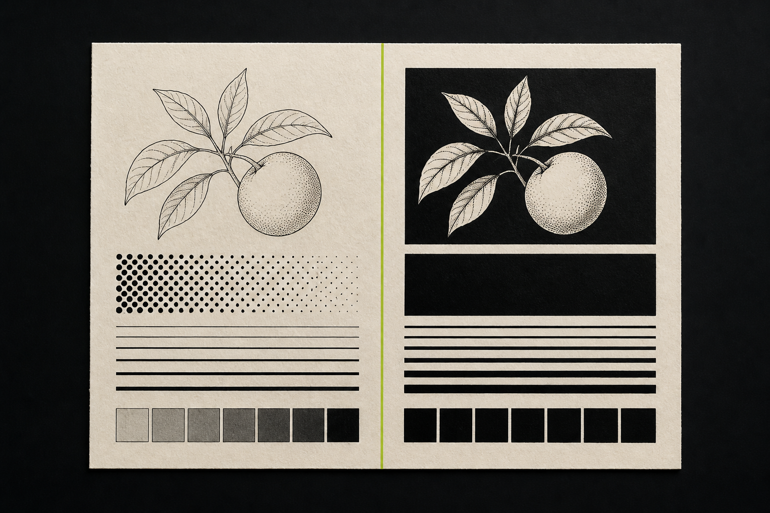
Rich Black vs Pure Black
For text and fine lines use K100 (Pure Black); for large black solids C40 M30 Y20 K100 (Rich Black) with care on screens.
Technical lines
Standard colour codes for cut, crease and perforation
Shops usually use named Spot colours so lithography operators do not split layers wrong. Align with your press — some want a separate PDF per layer.
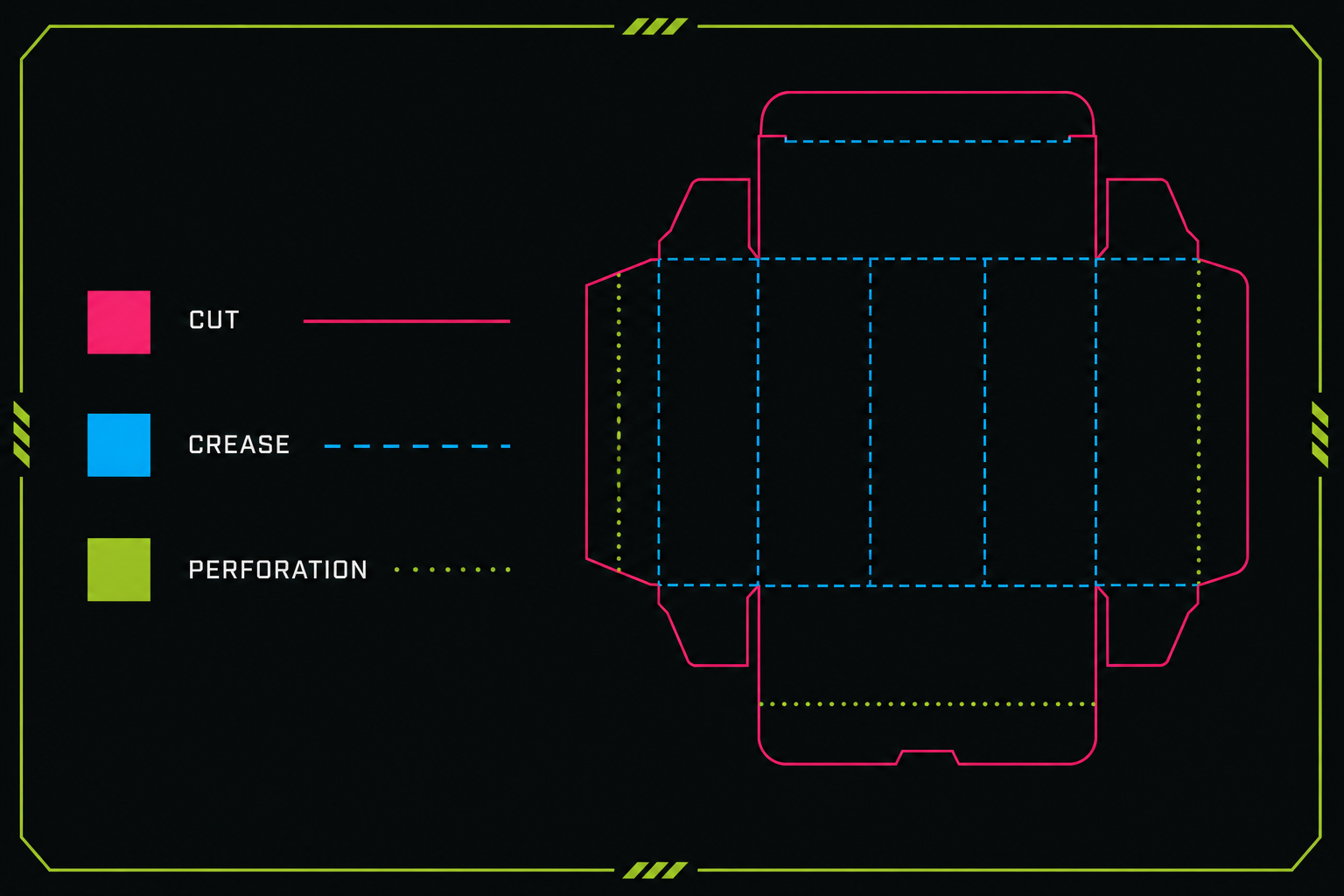
Cut / Die: Magenta or red — 0.25pt, Overprint
Crease: Cyan — 0.25pt dashed in some shops
Perforation: green — defined dash pattern
Glue flap: sometimes a separate layer or purple line
Standard colour codes for cut, crease and perforation.
PDF output for lithography
PDF/X-1a or PDF/X-4 per press workflow. Technical lines must stay vector, not raster. Screens typically 150–175 lpi on common board. Declare a separate layer for white underprint or spot UV if used.
Embed fonts or convert to outlines
Document bleed settings = 3 mm
No RGB objects in the preflight report
Die line on a separate layer, visible and printable
Common mistakes that ruin the print
Placing artwork on the dieline at the wrong scale — raster cut lines — forgetting board-thickness compensation on two-sided designs — exporting with “simulate overprint” off and never checking the result.
Bleed error versus correct output.
Order of sending files to the press
From dieline to plate approval
1
Receive the final dieline
Blank PDF/SVG with cut and crease from the online tool or die designer.
2
Place artwork + preflight
Run the CMYK, bleed, overprint and DPI checklist.
3
Send to lithography
Single PDF or separate layers per press agreement.
4
Approve the proof
Compare colour and cut position on the proof sheet before the run.
FAQ
Why does cut-line Overprint matter?
Without Overprint, the RIP may keep white under the cut stroke and create unwanted edges or colour gaps in print.
Is 3 mm bleed enough for every job?
For most offset carton work, yes. Some presses want 5 mm on large formats — always get the spec sheet.
Can I design in RGB and convert at the end?
Not recommended; brand colours may shift. Design in CMYK from the start or with the contracted ICC profile.
Should crease lines be dashed?
In graphic files they are often dashed so they are not confused with cut; final lithography output is solid or dashed per shop standard.